The Idea
Built from a real obsession. Designed from the inside out.
ArKade Systems is not a hypothetical. It is a brand rooted in something I actually built with my family during COVID — a full custom arcade cabinet that I have to this day. I handled all of the graphic art while we built the cabinet itself, and the two influenced each other constantly throughout the process. That hands-on experience gave this project a level of authenticity that is impossible to fake. ArKade combines "arcade" with "Kreitsch" — it is as personal as a design project gets.
I have built at least two of these systems, designed a full manual for the experience, and spent a significant amount of time obsessing over retro games — especially Super Nintendo and Sega Genesis. That deep familiarity with the subject drove every decision on this project, from the identity to the interactions. This is a site for gamers who want to have fun, and it was designed by someone who genuinely is one.
Research & Direction
From mindmap to mood board — finding the visual language.
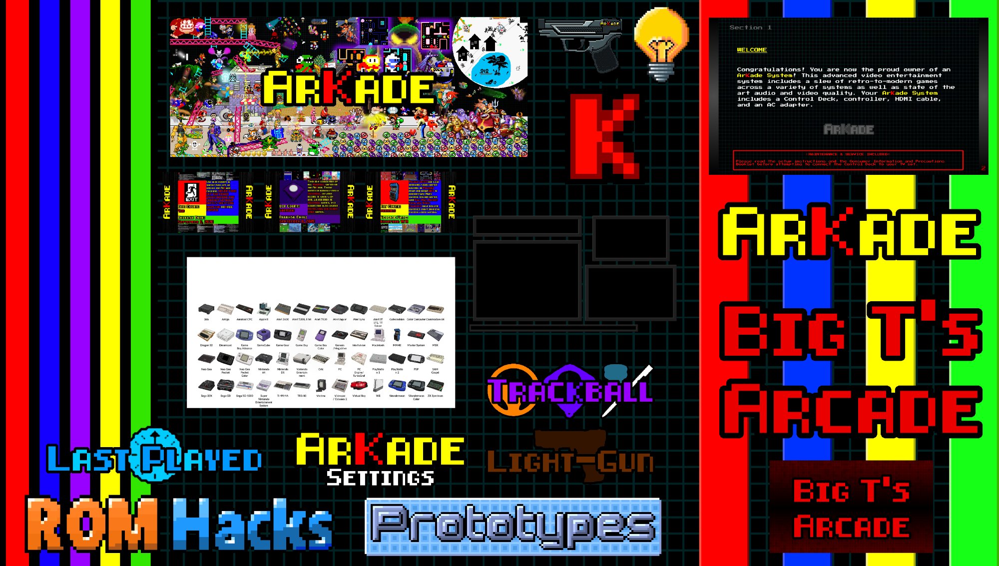
The early mindmap focused on the product itself rather than how to represent it visually. I quickly shifted focus to the design language of the cabinet — the colors, the button shapes, the pixel art frames. The background started as dark gray, but white ultimately created a stronger contrast for the bold visual elements the brand demanded.
The mood board locked in the direction: red and black as the primary palette, color stripes pulled directly from the joysticks on the physical cabinet. The pixel block designs from the frames under the red "K" logo became the direct inspiration for the button style throughout the site. This was not arbitrary — the site and the cabinet are the same object, just in two different dimensions.
The ArKade logo has been in use since 2020. The Kade mascot was created as a second home icon and brand representative — giving the system a character-driven identity in the tradition of retro gaming culture.
Design Process
The wireframe was a starting point, not a blueprint.
The wireframe evolved significantly. The Games Page was completely overhauled from a simple gallery into a far more dynamic and interactive experience. Page sizes changed across the board, with the final prototype leaning heavily on scrolling layouts that feel natural on both desktop and mobile. The original wireframe treated all pages as the same fixed size — the final prototype knew better.
The secondary and tertiary color palette expanded beyond the original red and black. Over time ArKade grew into its own color system — one that started with joystick colors but developed into something with its own identity, reflecting the variety and energy of the games it celebrates.
Standout Features
Two features that defined the final prototype.
Looping Homepage Video
A looping video on the homepage brings the site to life in the way a travel site pulls you in with a destination. The source footage already existed from the cabinet build in 2020 — it just needed to be edited into a seamless loop. The goal was to eliminate the static feeling that kills engagement on portfolio and product sites.
40-System Carousel
Displaying over 40 game systems — each with a custom pixel art illustration and description — required more than a flat image grid. The carousel format gives each system the space it deserves while keeping the page dynamic and navigable. Wiring 40 artboards together was a considerable undertaking, but the result is a browsing experience that feels true to the subject matter.
Reflection
What this project proved.
ArKade Systems demonstrates what happens when a designer works on something they genuinely care about. The identity is consistent because the inspiration was consistent. The interactions feel intentional because they were built around real constraints — 40 systems, a manual's worth of copy, a physical cabinet that already had a visual language. Every design decision had a reason, and most of those reasons came from years of living with the subject before the project even started.